Power BI
Transforming raw operational data into actionable inventory intelligence
These sample Power BI project demos are personally built by me and reflect real-world supply chain scenarios.
They show how I structure data, design KPIs, and create clear, interactive dashboards that turn complex information into practical, decision-ready insight.
Vendor‑Held Inventory Dashboard

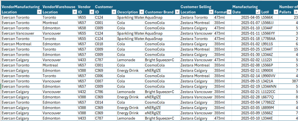
A fictional Softdrink Manufacturer Zestara maintains a vendor‑held inventory with their also fictional can supplier Evercan across multiple production and distribution sites who provides monthly inventory records. However, the Excel dataset provides transactional detail only: pallet counts, lot numbers, production dates, storage locations, and other operational attributes. In its raw form, the data offers no visibility into aging risk, value exposure, or location‑specific inventory health — all of which are critical for proactive material planning.
To address this, I imported the dataset into Power BI and integrated it with cost data to create a unified analytical model.
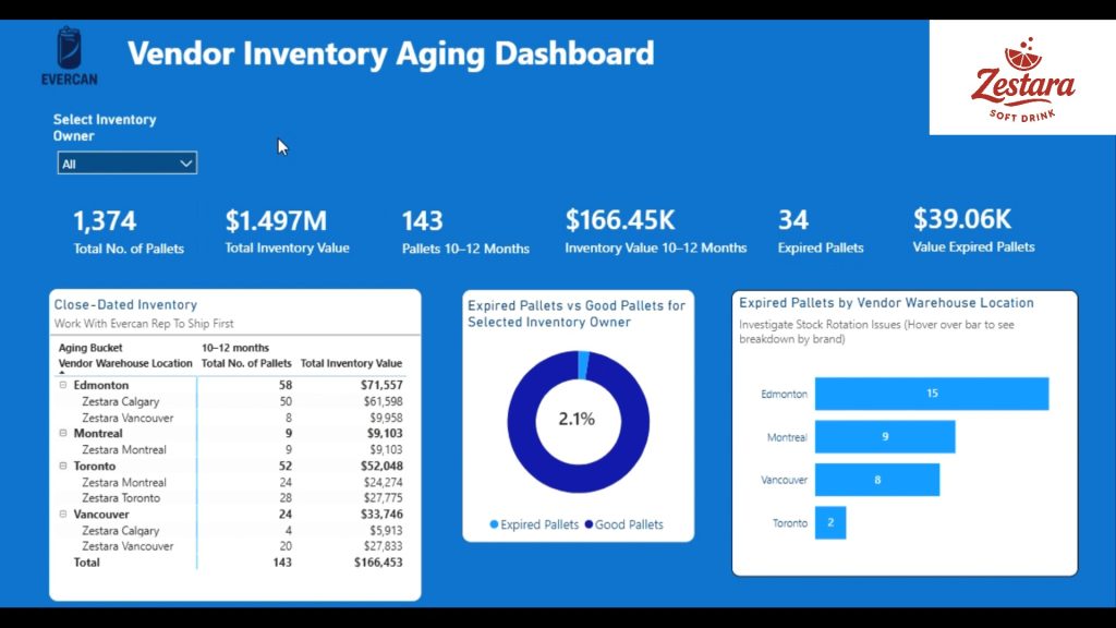
This allowed me to calculate inventory age, classify pallets into aging buckets, quantify value at risk, and surface insights that support timely decision‑making.

The dashboard was designed to answer the core operational questions a material planner faces:
- Is all inventory within shelf life? If not, what is the value associated with expired inventory?
- Which pallets are approaching their shelf‑life threshold, and where are they located?
- What is the total inventory value by brand, location, and aging category?
- How does aging risk vary across the Zestara network?
- Where should planners focus their attention to prevent write‑offs?

- Aging bucket logic (0–3, 4–6, 7–9, 10–12, 12+ months) to quantify risk exposure
- Expired vs. good inventory segmentation, expressed in both pallet count and percentage
- Value‑at‑risk calculations based on cost integration
- Brand‑level and location‑level breakdowns to support targeted action
- Interactive slicers enabling users to view the entire Zestara group or drill into individual sites
- Dynamic KPIs for total pallets, total inventory value, and aging‑related metrics
This analytical structure allows planners to quickly identify which products require immediate movement and coordinate with their Evercan representative to reduce the likelihood of expired inventory.
By transforming a simple spreadsheet into a structured analytical model, the dashboard provides:
- Early visibility into aging trends
- Quantification of financial exposure
- Improved prioritization for inventory movement
- A proactive approach to shelf‑life management
- A clear communication tool between Zestara and Evercan
This project demonstrates my ability to take raw operational data, model it effectively, and design a decision‑ready dashboard that supports real‑world supply chain planning.
Vendor‑Held Inventory Dashboard DATA